
Two Blues
Four teams are left in this World Cup. The final is Sunday. And before a single name is announced, before a badge is even visible on screen, you’ll know exactly who is playing. Sky blue and white stripes. All white. Deep navy. Red. No logo required.
I’ve been watching this happen my whole life. I just didn’t always know what I was looking at.
Naples, 1990
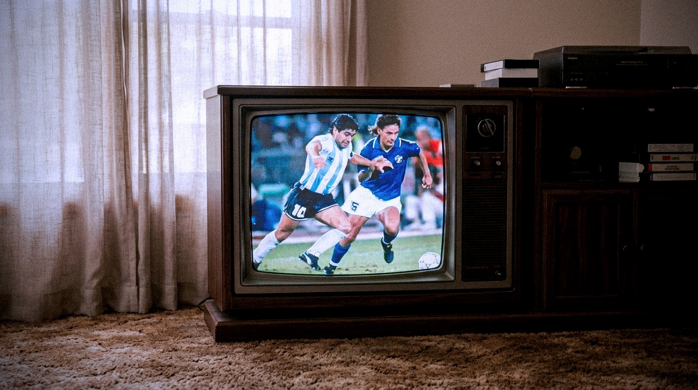
My first World Cup was Italia ’90. I was a kid, and the semifinal I remember was Italy against Argentina in Naples – though I didn’t understand, at the time, most of what made that night heavy. Maradona was Naples’ adopted son, now here to take down Gli Azzurri on their home soil. His 1986 World Cup winning performances were something I’d only absorbed in passing – the way kids absorb things: secondhand, half-understood, enormous anyway.
What I did understand was that both teams were somehow mine. I have deep Italian roots. My mother’s side had emigrated to Argentina – it’s the country she was born in. So on that pitch were the Azzurri blue of one home and the sky-blue-and-white stripes of another, and I had no idea yet that this was a strange inheritance. It just felt like the whole television was pointed at my family.
Italy lost, on penalties. I would learn, over the years, that this is a very Italian way to lose.
The wall
My grandfather had a framed photo of the 1982 Italian national team on his wall. World champions. It hung there the way important things hang in the houses of immigrants – not decoration, but evidence. Proof of where you’re from and what where-you’re-from is capable of.
I had a frame of my own in my bedroom. A World Cup poster, bordered with the flags of every competing nation. I studied it constantly without knowing I was studying anything – why some flags carried more weight than others, why certain colour pairings felt inevitable, why I could pick out Brazil’s from across the room. Dozens of small rectangles, each one holding an entire country in a few shapes and colours.
Two frames, two generations, same habit: standing in front of an image and paying attention to every detail. I became a designer eventually. Looking back, I’m not sure I had much say in it.
Carbon dating
Here’s a game you can play with any old World Cup footage: guess the year from a single frame. You’ll be close, every time.
The washed-out chroma and the short shorts say the 80s. The baggy fit and grainy broadcast say the 90s. The 2000s arrive in cleaner digital colour, and today it’s HD so true to life you can see the knit of the fabric and the sweat on the crest. Every era has its own texture. The footage dates itself instantly – the cut of the kit, the colour of the transmission, the haircuts, all of it.
Except one thing. The stripes don’t date. Netherlands’ Oranje or Brazil’s yellow with green trim. Italy’s blue is Italy’s blue whether on a tube TV or in 4K. Same for Germany’s flag colours in a geometric pattern on crisp white. And Argentina in 1986, 1990, 2022, this Wednesday – their iconic white and sky blue stripes read the same through every generation of screen. The textiles change every tournament. The broadcast technology changes every decade. The identity survives all of it.
As a designer, I eventually got the vocabulary for this: strong identities survive the medium. Weak ones depend on it. But I knew it in my bones long before I could say it.
The number ten
For Argentina, the 10 on the back used to mean Maradona. Now it means Messi. Someday it will mean a kid who hasn’t been born yet.
That’s the part that gets me, honestly. The players age out. The managers cycle through. The stadiums get rebuilt and the tournaments move continents. But the shirt is a vessel, and what it carries – the national pride, the love you can feel coming through the screen, whatever screen it happens to be – passes through intact. Every four years the world puts the same colours back on and pours everything into them again.
The kit is the thread. Everything else is just the era it’s stitched through.
What I took from it
I build brands and websites now, and I think about those kits more than anyone would guess.
Because every project arrives with the same temptation: change everything. New platform, new palette, new voice, new everything. The blank canvas feels like freedom. But the teams I could name from the top row of a stadium never took that deal. They decided, long ago, which two or three things would never be up for discussion – and then let absolutely everything else evolve around them.
So that’s become my first real question in any identity work: what are your stripes? What survives the redesign, the replatform, the trend cycle? Find that, protect it stubbornly, and the rest – the textile, the technology, the era – can change as often as it needs to.
Both kinds of tears
I’ve been on both sides of it.
I’ve watched Italy and Argentina each walk to the edge of everything and lose – finals slipping away, penalties missed, that particular silence that falls over a living room full of family. Tears of anguish, real ones. And I’ve had the other kind too: the ones that came when each of them finally won, when the whole room detonated and strangers on the street were suddenly cousins.
Here’s what I’ve noticed about both kinds. The feeling doesn’t attach to a scoreline or a trophy. It attaches to the colours. When the camera finds the crowd after a goal, it’s a sea of one shirt, and your body responds before your brain does because those stripes, that blue, they’re not a uniform to you. They’re everyone you’ve ever watched a match with. The kit is where the love gets stored.
Where it gets made
The final is Sunday. Somewhere, a kid is going to watch it crowded onto a couch with family and friends, half-understanding what’s happening, fully understanding that it matters. Their team might win. Or they might lose. It almost doesn’t make a difference – that’s the secret adults forget. The core memory isn’t the result. It’s feeling something real, together, and the colours it happened in.
That was me. A kid staring at a poster bordered with flags, studying every detail without knowing why, because the game had already gotten in and I wanted to hold onto every part of it.
Did that shape me as a designer? Almost certainly. The eye for what a few colours can carry, the respect for the things that never change. I can trace all of it back to that wall. But the design was the indirect result, the byproduct. The love of the game was the driver. It still is. And every four years, the colours come back to remind me.